
It’s an opinion,
deal with it!
Project Background
Axel is a self-defined movie buff who regularly reviews movies, TV shows, and occasionally video games. Axel built up a small following on his website axelleratedreviews.com (AR) and has been steadily developing and growing his content.
Requested Services
Blog banner templates, website redesign, social media redesign, post templates
The Problem
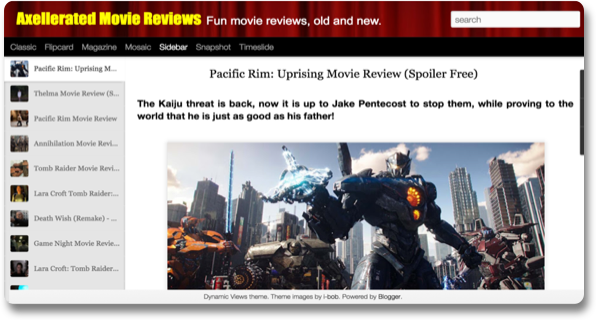
When Axel first approached me, his main concerns were the dated design of his website and the complexity of navigating it as a reader. Another area which we agree needed to be addressed in this project was the lack of a distinct and consistent (brand-) identity across AMR’s different platforms.
The Solution
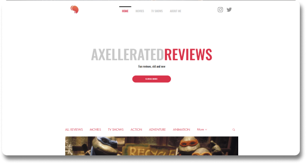
Less is more, no bells and whistles, no distractions. I increased the amount of white space to help his readers focus on the content. To simplify things further we categorized posts under commonly defined labels and improved navigation. In an attempt to provide AR with a more identifiable brand I created a new logo and introduced basic design guidelines that he could implement down the road.
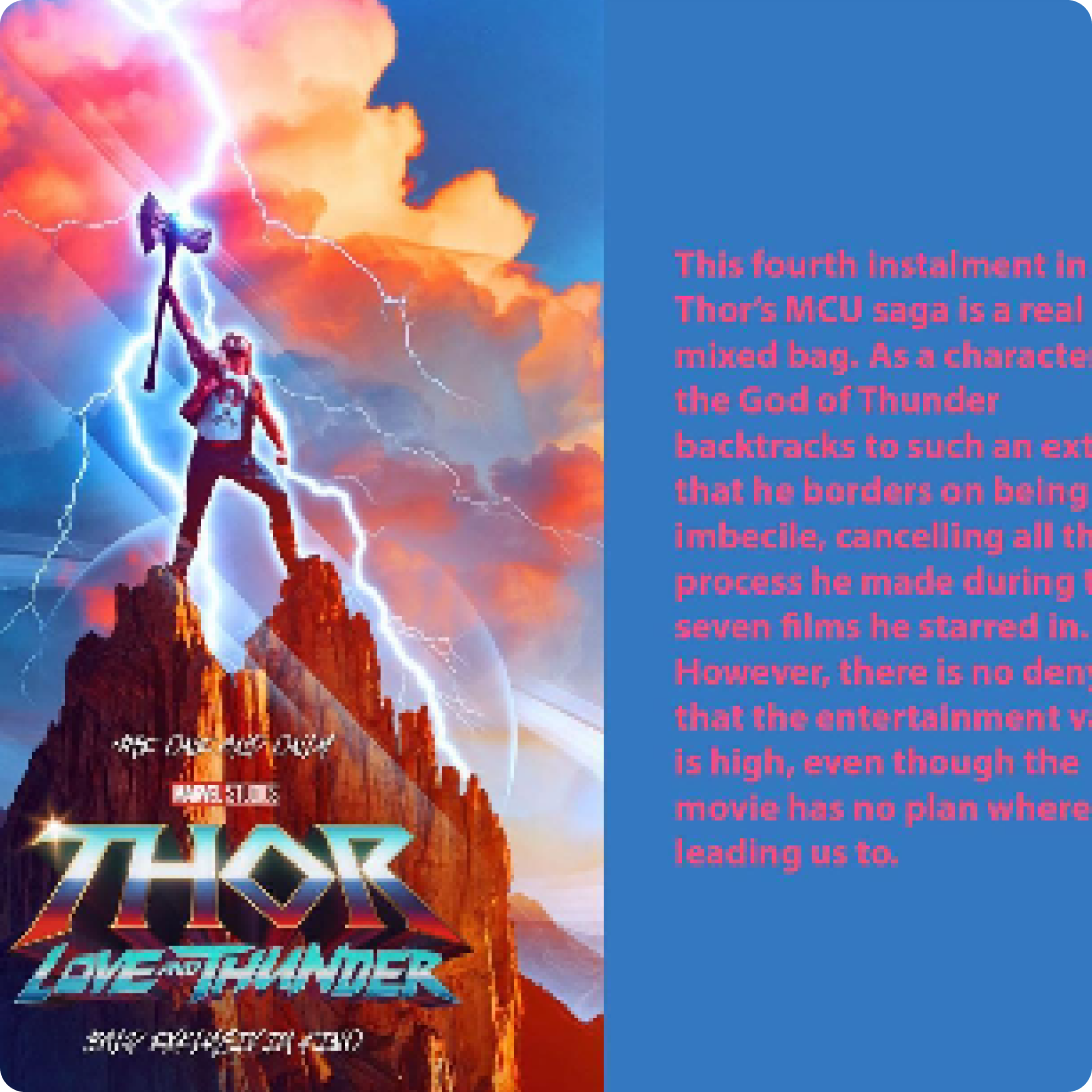
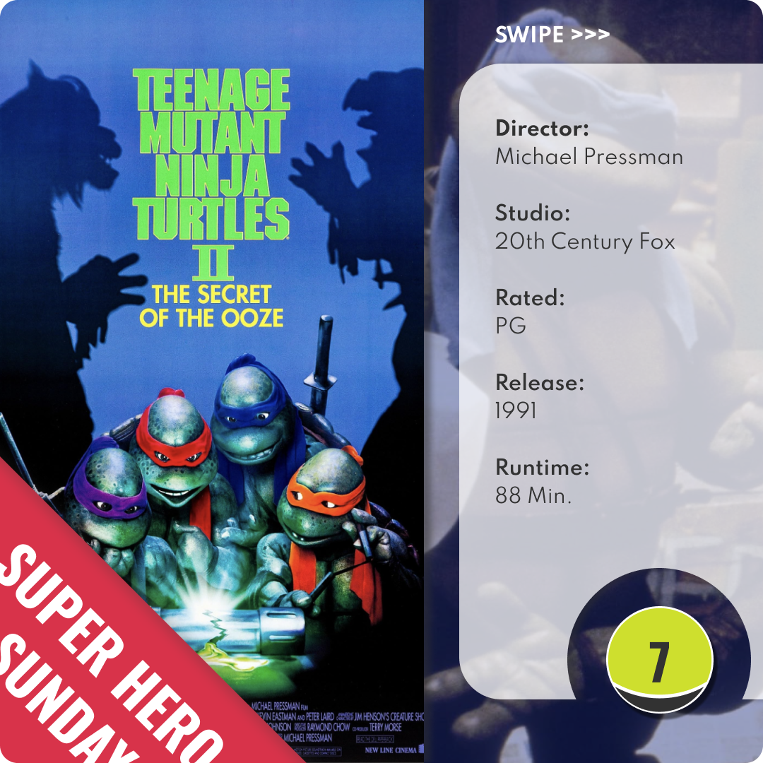
I also worked with Axel to clean up inconsistencies in his Instagram posts by creating reusable, drag and drop templates. The modified layout allows his audience to instantly see his ratings. If that peeks their interest, readers can then swipe to a more easily legible summary.
Like what you see?
Let’s build something together.
Thank you for your response. ✨

